

Drive Your Dental Practice Growth with
Websites that are proven to attract new patients


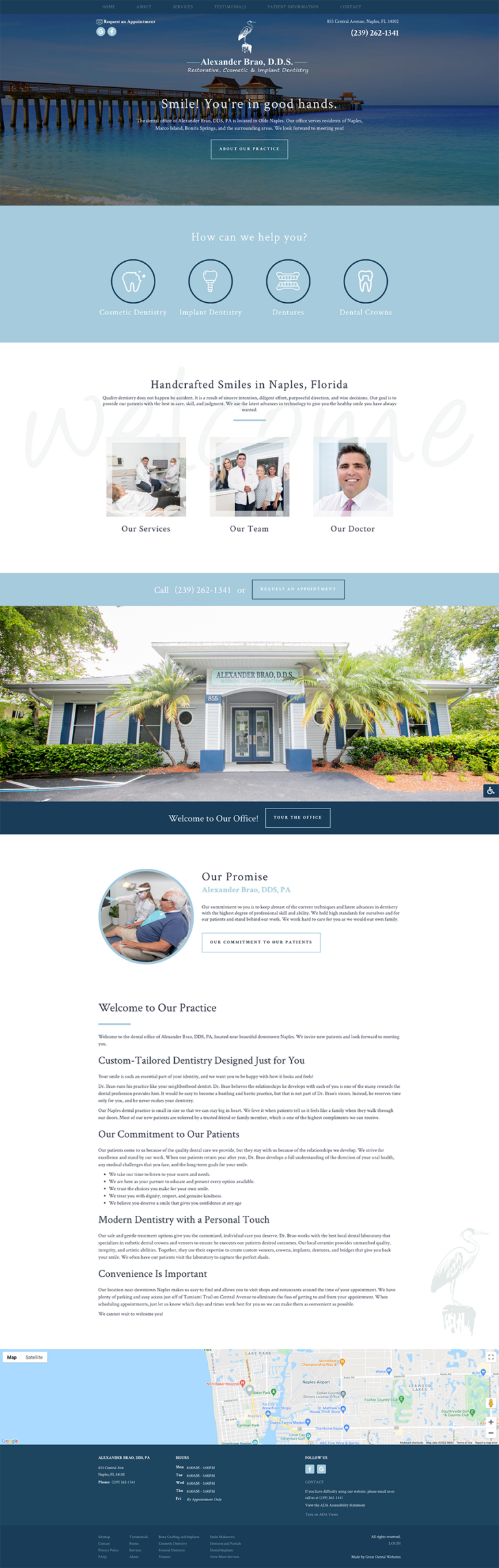
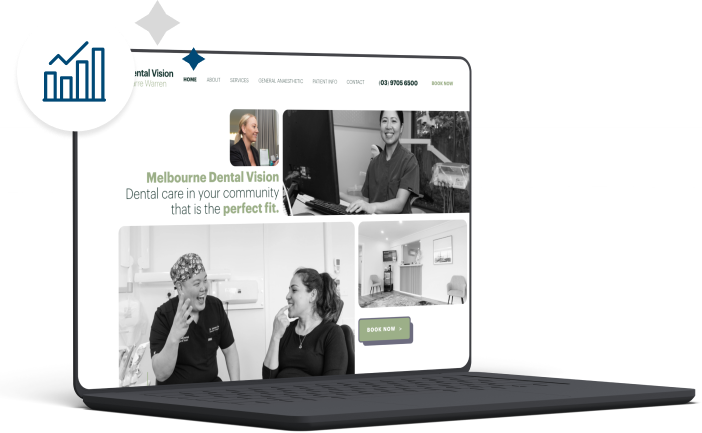
Dental Website Design Done Right
Our internationally recognised ability to combine stunning dental website designs with data-driven marketing techniques gives dentists the power to gain a local presence and drive healthy practice growth.
Specifically engineered for dental and specialist practices of all sizes, our dynamic platform delivers periodic updates relevant to search engines and patients alike while allowing dentists to update their content at any time.
-
Paid Search
-
Search Engine Optimisation
-
Content Creation
-
Marketing Coaching
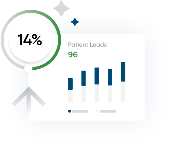
Attract a Steady Stream of Patients
Dental PPC is a targeted online marketing service that displays ads at the top of search results when a new patient searches for a specific keyword like “dentist near me” or “Invisalign Sydney.” You only pay for the advertisement when someone interacts with your ads, either through clicking through to your site or calling from the ad. This makes it easy for your practice to control costs. Organic SEO is the cheapest way to get noticed, but it can take a while to achieve the maximum benefits. Pay-per-click ads allow your practice to hit the front page of search engines, like Google, right away.
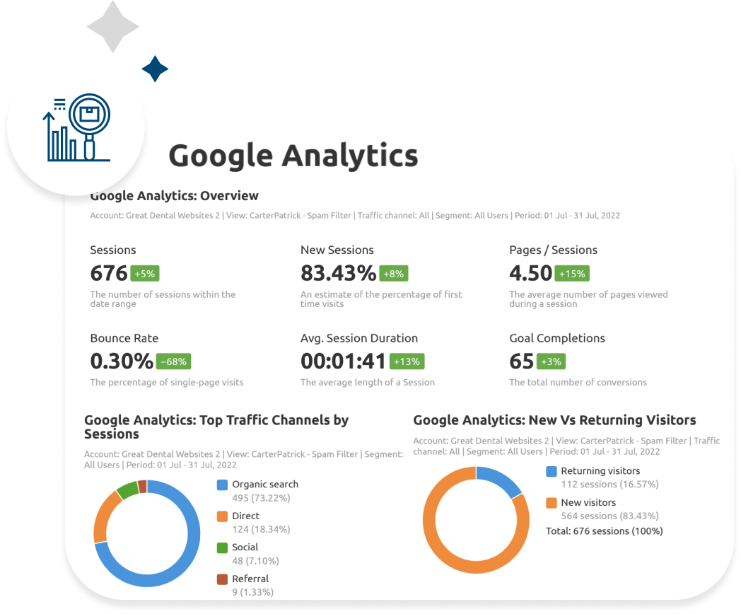
Sustainable Practice Growth
We identify and expertly use dental SEO strategies that allow your dental website and practice to rise to the top of the search results page when potential patients use search engines to find a new dentist. We focus on ethical dental Search Engine Optimisation techniques that give you long-term results instead of so-called “black hat” techniques that can cause short-term gain but have potential long-term consequences. GDW does it the right way for our clients. No exceptions.
Compelling Copy to Attract Patients
Our dental copywriters are all experienced with dental websites and understand the intricacies of writing content for search engines that is also impressive and informative to patients. They avoid specific minor details of the procedures, which can bore patients or, worse, scare them. Instead, your website's copy will explain to your patients how your unique approach to dentistry will improve their lives through better oral health.
Get an Actionable Plan
We know it's crucial to track and monitor marketing efforts to maximise your efficiency and grow your dental practice. Whether you are utilising various marketing services like digital advertising or SEO, or you have no idea where to start with your marketing efforts, GDW's dental marketing consultants are here to help.
-
Paid Search

Attract a Steady Stream of Patients
Dental PPC is a targeted online marketing service that displays ads at the top of search results when a new patient searches for a specific keyword like “dentist near me” or “Invisalign Sydney.” You only pay for the advertisement when someone interacts with your ads, either through clicking through to your site or calling from the ad. This makes it easy for your practice to control costs. Organic SEO is the cheapest way to get noticed, but it can take a while to achieve the maximum benefits. Pay-per-click ads allow your practice to hit the front page of search engines, like Google, right away.
-
Search Engine Optimisation
Sustainable Practice Growth
We identify and expertly use dental SEO strategies that allow your dental website and practice to rise to the top of the search results page when potential patients use search engines to find a new dentist. We focus on ethical dental Search Engine Optimisation techniques that give you long-term results instead of so-called “black hat” techniques that can cause short-term gain but have potential long-term consequences. GDW does it the right way for our clients. No exceptions.
-
Content Creation
Compelling Copy to Attract Patients
Our dental copywriters are all experienced with dental websites and understand the intricacies of writing content for search engines that is also impressive and informative to patients. They avoid specific minor details of the procedures, which can bore patients or, worse, scare them. Instead, your website's copy will explain to your patients how your unique approach to dentistry will improve their lives through better oral health.
-
Marketing Coaching
Get an Actionable Plan
We know it's crucial to track and monitor marketing efforts to maximise your efficiency and grow your dental practice. Whether you are utilising various marketing services like digital advertising or SEO, or you have no idea where to start with your marketing efforts, GDW's dental marketing consultants are here to help.
Want Free SEO Advice for Your Practice?
Chances are you've seen dental SEO audits before, but not one like this. We give out actionable, research backed SEO recommendations that are specific to your dental website, and customized for your practice's unique market, totally for free, no commitment required.
.png?width=1080&height=900&name=Untitled%20design%20(53).png)